Introducing the New Face of MySeemly
When the MySeemly team approached us, the challenge was to create a corporate identity and a symbol/icon that would represent this new application—based on an initial concept already envisioned by the client.
Designed for marketing professionals, retail sales teams, and store managers, this application is being developed with simplicity, efficiency, security, and quality in mind. Therefore, its identity had to reflect these key characteristics.
How Did We Arrive at the Solution?
From the very beginning, open communication and continuous collaboration between Wechase and MySeemly were essential in crafting a distinctive brand identity.
The final design embodies:
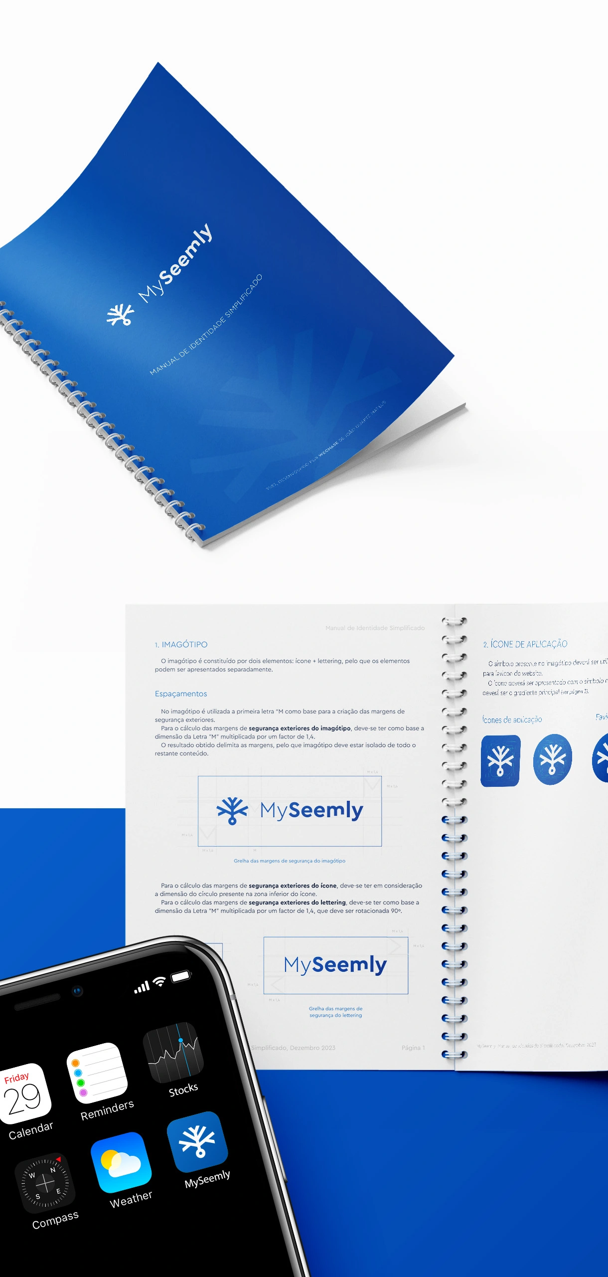
Shades of blue – symbolizing technology and security.
Branched elements in the symbol – representing customization options, an idea originally conceived by the MySeemly team.
Now, MySeemly is fully equipped with a strong, unique identity to stand out in the tech market.